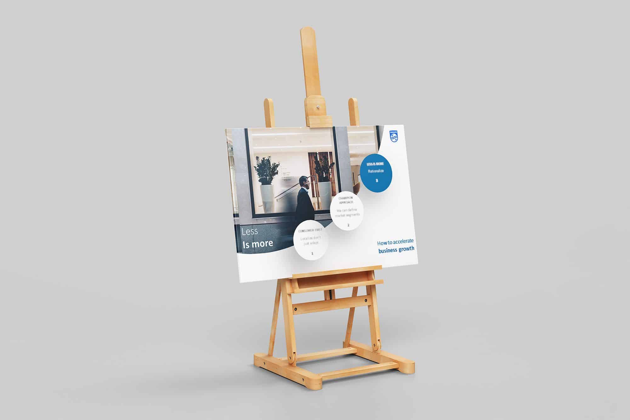
Presentation design for a major brand – Insights and reflections on the general approach
“We are one of the few agencies that offer comprehensive services in the field of presentation design. Essentially, we can create a presentation from scratch, managing the creation of the story arc, content and design. We employ a range of elements that help us build impactful presentations – the big idea, the shift we aim to generate, story bits (elements through which we construct the argumentation for the ideas supporting the shift), and more.
We had the opportunity to actively participate in developing a presentation for a global organization in the field of electronics and home appliances, with a history spanning over a century. In the interest of maintaining confidentiality, we cannot disclose the exact name of this organization, but we can use a symbolic name to represent it – let’s call it the ‘blue organization’.
The presentation was meticulously crafted within a specific business line, intended for a significant internal event. Our contribution primarily focused on the realm of graphic design, representing a vital component in this context. However, it’s important to emphasize that graphic design is just one piece of the puzzle. Indeed, the essence lies in the ability to create and convey a coherent story narrative – that storyline arc that captures and sustains the audience’s attention.
While graphic design is crucial, it merely complements and underscores the core message. An impressive graphic design, though visually appealing, cannot compensate for the absence of a captivating story. The audience will gradually disengage if we fail to capture their interest through a well-constructed narrative. Thus, we understand that the success of a presentation stems from the delicate balance between the narrative content and the visual manner in which it’s presented.
All global organizations have extensive style guides and, inevitably, numerous templates and restrictions when it comes to presentation design. They are absolutely necessary, but the balance between standardization and creative freedom is crucial. Excessive standardization can stifle creativity, both in storytelling and design. On the other hand, too much freedom can lead to chaos, ultimately resulting in situations where the presentation cannot be associated with the brand. What constitutes the optimal balance isn’t a universal rule; it depends on each organization and can only be determined through thorough analysis.
Presentation design – a concrete example
In the case of the “blue organization,” there is a presentation design style guide that is well-calibrated to its specific needs, with enough restrictions to avoid creating incorrect presentations (in terms of the brand’s visual identity), but also permissive enough in certain aspects to allow for creativity. We appreciated that in addition to a set of clear templates and rules, there was also a very large universe of aspirational photographs featuring people in different situations. Essentially, there was a complete set of ingredients that could be easily and quickly combined to convey the message.
We visually recreated a series of slides to make them more dynamic and to grab attention through design. Additionally, where there was more information, we organized it to make it easier to understand and use.
Our contribution was relatively small, considering the extensive system that the “blue organization” has developed for creating presentations. However, we believe that we effectively reinvented certain areas free in terms of design allowed by the style guide.


