

Creating a Consistent Brand Image: The Importance of a Visual Identity Guide
In today’s competitive business landscape, it is crucial for brands to develop a strong visual identity that reflects their unique value proposition and resonates with their target audience. A brand’s visual identity consists of many elements, the most important of which is the logo. But a logo is just the beginning. To ensure consistency across all brand touchpoints, companies must develop a comprehensive visual identity guide that provides clear guidelines for the use of all visual elements.
A logo is a graphic element or emblem that serves as a symbol of a company’s identity. It should be unique, easily recognizable, and timeless. However, a logo alone is not enough to establish a strong brand identity. This is where the visual identity guide comes in.
A visual identity guide is a document that outlines the guidelines for using a brand’s visual elements, such as colors, typography, images, and more. A visual identity guide ensures consistency and helps maintain a cohesive brand image across all channels and touchpoints. It serves as a reference tool for everyone involved, including designers, marketers, and vendors.
A comprehensive visual identity guide contains many elements, including the history of the logo (if applicable), the target audience, tone of voice, typography, color palette, images, iconography, and more. It should be exhaustive and include all relevant details, such as color codes, typography options, and the correct use of the logo.
Without a visual identity guide, a brand risks inconsistency and confusion across all touchpoints. A lack of consistency can dilute its impact and, ultimately, affect financial results. The guide ensures that all visual identity elements are consistent and that the brand is communicated effectively across all media channels.
Creating other visual materials becomes much easier when there is a visual identity guide. A well-developed document like this makes it easier for designers to create new materials that are consistent with the brand’s existing visual identity. Marketing teams can also use the guide to ensure that both their campaigns and materials are aligned with the brand’s values and visual elements.
5 Critical Elements an Agency Should Consider When Developing a Visual Identity Manual
- Brand Identity – Make sure the manual aligns with the brand’s values and mission.
- Consistency —make sure all elements are consistent across all touchpoints.
- Simplicity —make sure the manual is easy to use and understand.
- Clarity —make sure it is clear and easy to follow.
- Flexibility —make sure the manual allows for some flexibility, but not at the expense of consistency.
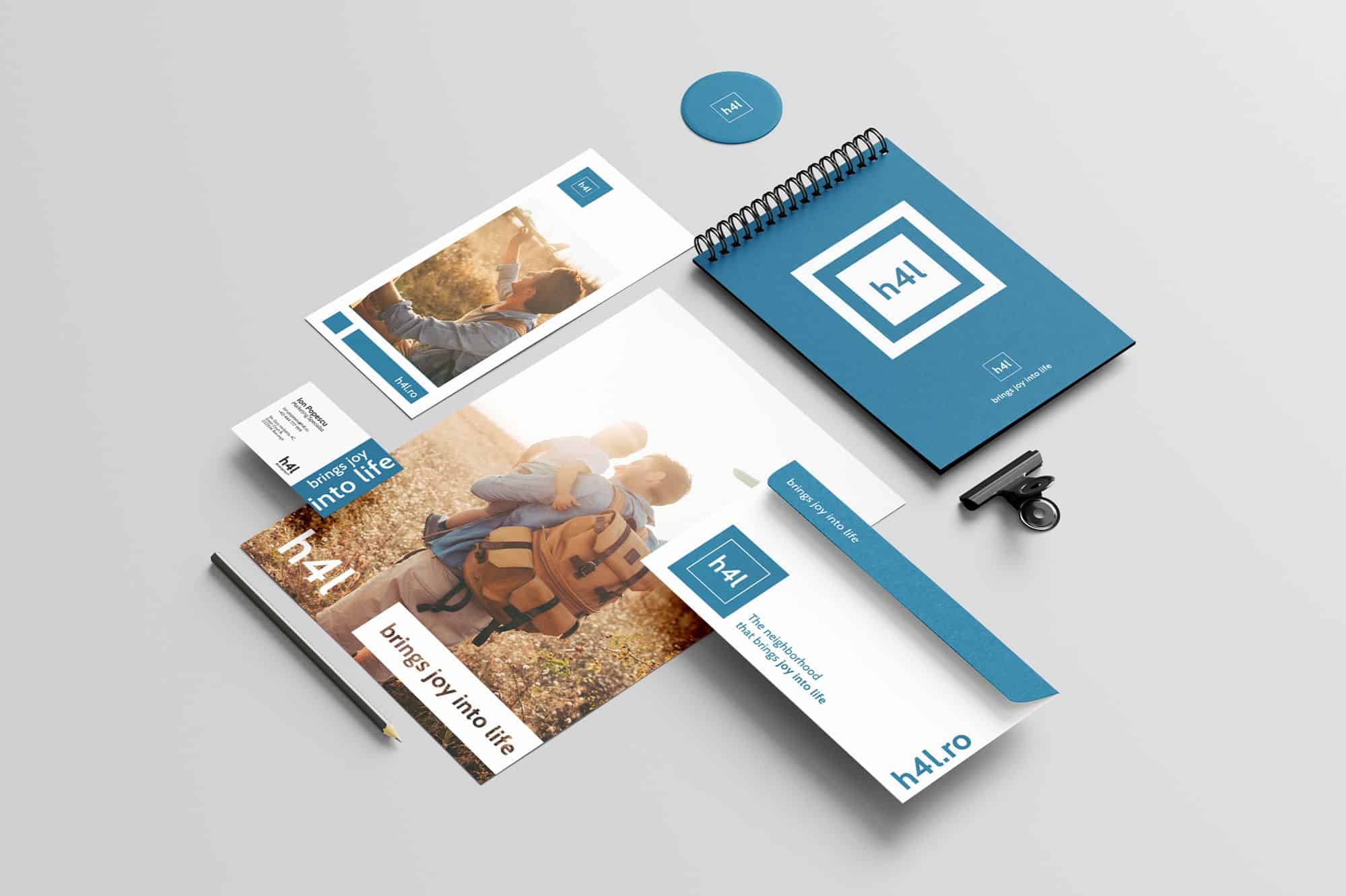
3 Examples of Well-Developed Visual Identity Manuals
- Airbnb’s Visual Identity Guide —this guide is comprehensive and includes details on tone of voice, typography, and color palette. It also includes examples of proper logo usage and guidelines for using photos and videos.
- The NASA Graphic Standards Manual —this guide, created in 1975, is a classic example of a comprehensive visual identity manual. It includes guidelines for typography, color palette, imagery, and even signage.
- The Coca-Cola Brand Identity Guide —this guide includes guidelines for logo usage, typography, and the color palette. It also includes guidelines for advertising, merchandising, and packaging.


5 Things to Avoid When Creating a Visual Identity Guide
- Don’t be too rigid: While a visual identity guide is meant to ensure consistency, it shouldn’t be so strict that it stifles creativity or hinders innovation. Make sure there is some built-in flexibility to allow for evolution and growth.
- Don’t overlook the user experience: A guide like this isn’t just about visual design; it should also take the user experience into account. Make sure it addresses how to create a clear and consistent message across all channels.
- Don’t forget to update it: A visual identity guide is a living document that should be updated regularly to reflect changes in the brand’s visual direction and messaging. Don’t just create it and then forget about it—make sure it’s constantly updated.
- Don’t make it too complicated: A document like this should be accessible and easy to understand for all team members. Avoid using excessive jargon or including too many details that might overwhelm readers.
- Don’t forget to emphasize its importance: Even the best visual identity guide is useless if team members don’t use it. Make sure you convey the importance of the guide and train team members on how to use it effectively.
In conclusion, a comprehensive visual identity guide is crucial for creating a consistent brand image. It provides clear guidelines for the use of all visual elements, ensures consistency across all touchpoints, and facilitates the creation of new materials that are in line with the brand’s visual identity. When creating a visual identity manual, companies should ensure that it aligns with the brand’s values, is easy to use, and allows for some flexibility while maintaining consistency. By following these guidelines, brands can create a coherent and memorable visual identity that resonates with their target audience.







Resources:
- forbes.com
- zoho.com
- linkedin.com
- proofed.com
- masterclass.com
- 99designs.com
- canva.com
- adobe.com
- This article was written with the help of ChatGPT






Share this article