
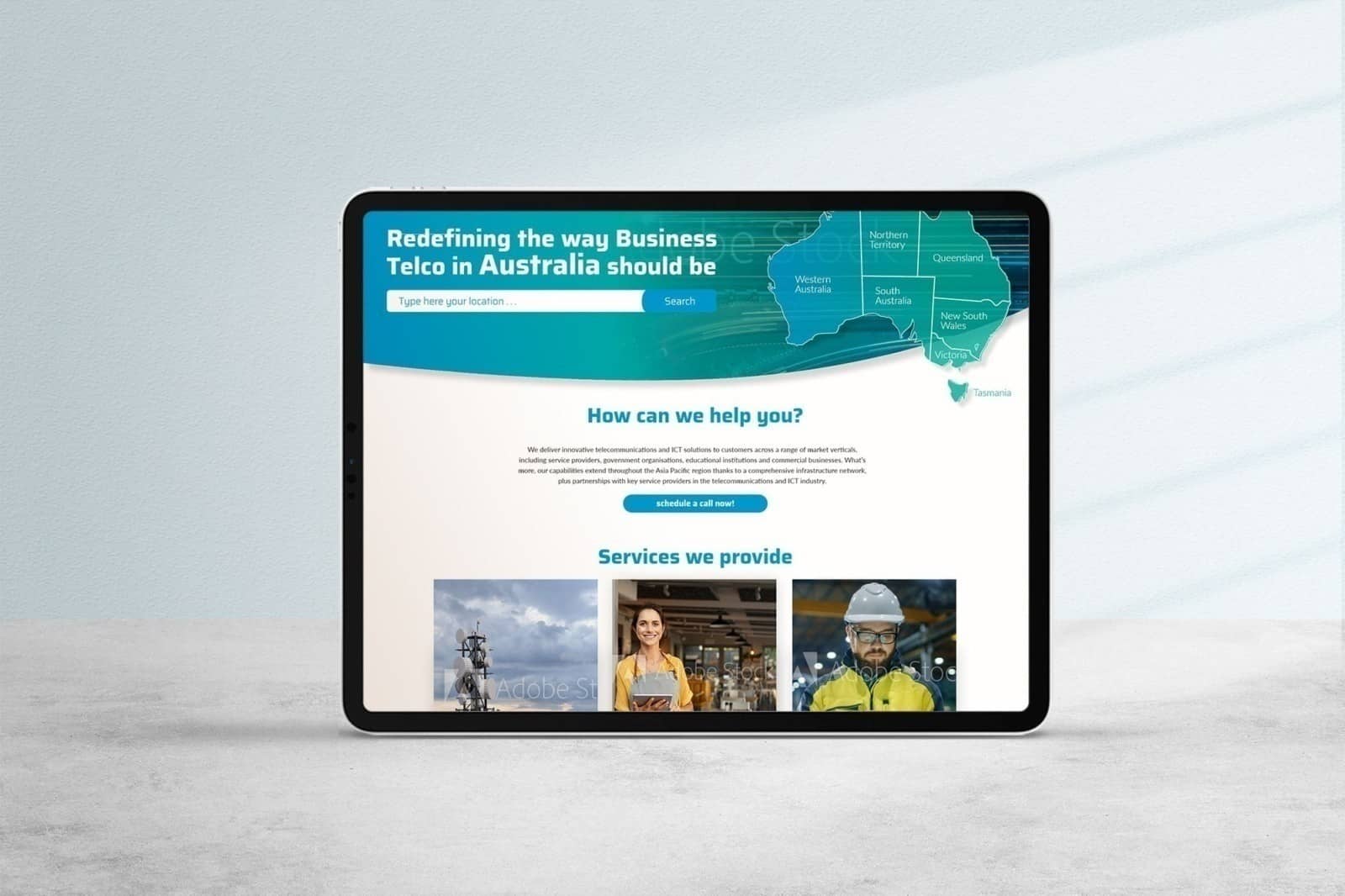
On Q Communications
UI wireframe for an Australian telecommunications provider
Project
Website UI – desktop version
About organization and audience
On Q Communications is a leading full-service telecommunications provider that serves Australian businesses with employees working from home (both company employees and independent contractors), ranging from small businesses to large corporations, whether they have one or more locations.
Website – onq.com.au
Industry – Communications
Country – Australia
About the change – customer
Although On Q Communications has an existing website, it is not only very outdated but also fails to reflect the brand’s desired image and positioning, as well as its product portfolio (features and benefits) and available plans. The new website, which should be clean, simple, and bold, must also incorporate the brand’s new visual identity.
About the change – TOUD
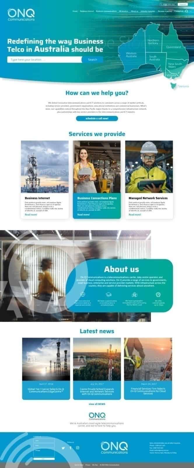
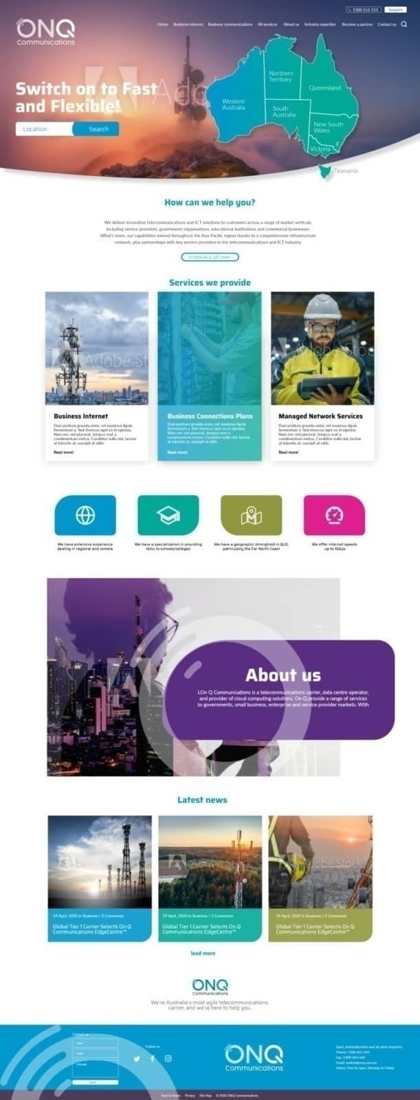
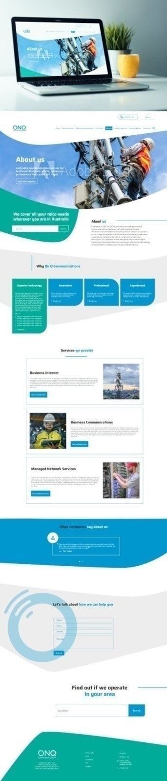
Following the brief, the UI wireframe, and the style guide provided to us, we sought to create a positive experience based on the new visual identity. We used powerful, realistic images featuring telecommunications poles and workers in the field, which, first and foremost, avoid clichés. We structured the information so that it is easy to identify and access. We highlighted the services offered by the company, as well as its strengths. We used blocks in the primary colors of the new visual identity, which we combined with plenty of white space to create an airy, simple, and clear design.
Deliverables
UI design for 4 pages—desktop version—brief and UI wireframe provided by the client
TOUD solution
After several rounds of design, we got to the proposals below.






Leave a Reply
Want to join the discussion?Feel free to contribute!