
Cosmetics Visual Identity – Homeo Cosmetics
Logo, colors, fonts, images – cosmetics branding

Proposal for a visual identity for professional cosmetics – Doctor T
This is one of the first Toud projects developed by the current team (2020). We began this project with a fairly broad brief. This allowed us to explore some very bold design directions. We built the visual identity around the idea of purity. This also led to the logo, which resembles a drop of water.
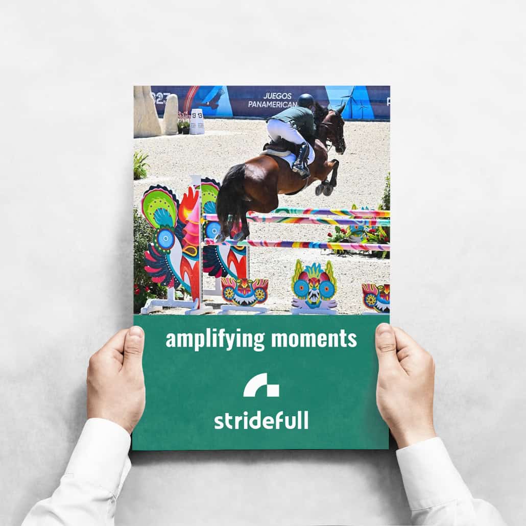
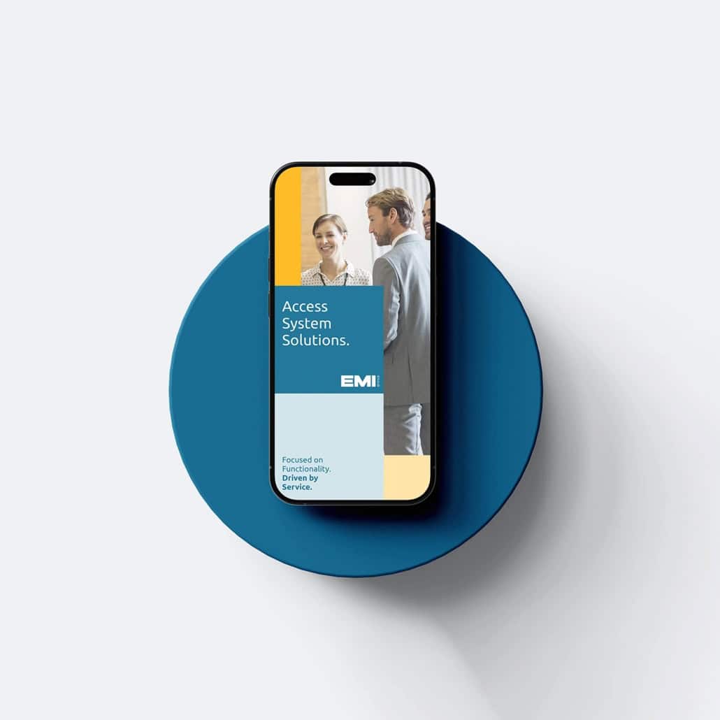
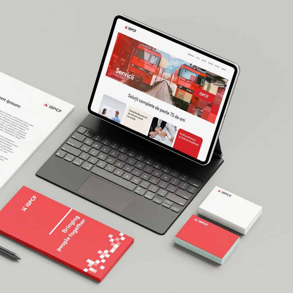
Below, you can see several mockups we’ve created, as well as a series of elements, all designed to tell the story of a product that’s quite bold and new to the Romanian market.
Tools: InDesign, Illustrator, Photoshop





Leave a Reply
Want to join the discussion?Feel free to contribute!